BuckShop.
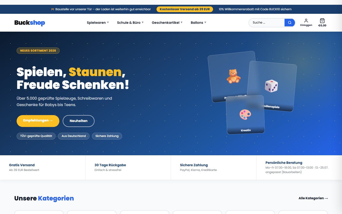
UX and interface work for a Shopify store with a broad toy and stationery range.
Scope note: No approved conversion or revenue data is available for this case study. It therefore describes only the concrete design and structure work.
Starting point.
A broad range places high demands on orientation. Categories, promotions, and product information need to be quickly distinguishable without losing the shop's friendly character.
The work.
NJUME reviewed user journeys, organized key shop areas, and refined the visual hierarchy. The focus was on navigation, category entry points, and the presentation of purchase-relevant information.
Decisions.
Existing colors and brand traits were carried forward. Recurring modules and clearer priorities are meant to make the path from category to product easier to follow, and to accommodate new content without a stylistic break.
Result and scope.
What's documented is the currently visible shop presence. A complete before-and-after archive and verifiable result figures haven't been published. NJUME therefore makes no claim about a measured increase in conversion rate here.
Documented structure and interface work, without claiming results that aren't backed up.
View BuckShop live ↗